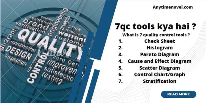
7 Quality control tools क्या होता है ?
7qc tools kya hai एक problem solving tool है , जिसमे हम data को collect करते है , और फिर data को analyzing करते है उसके Root cause को identifying करना और उसके results को measuring करते है।
7 quality tools hindi ( 7QC tool क्या है )
इस 7 quality control tools में हम सभी Data को Numerical form में collect करते है।
7qc tools types 7qc tools kya hai
- Check Sheet
- Histogram
- Pareto Diagram
- Cause and Effect Diagram
- Scatter Diagram
- Control Chart/Graph
- Stratification
1. Check sheet
Check sheet क्या है ?
Check sheet एक structured तैयार किया गया document type है (7qc tools kya hai ) में हम किसी Data को collect करके उसको analyzing करने के लिए use करते है check sheet एक generic tool है जिसके द्वारा हम कई तरह के Data को उनके types के अनुसार Collect कर सकते है , check sheet एक documented form है जिसमे हम real time data को collect करते है। Check Sheet को हम Tally Sheet भी कहते है।
Check sheet के प्रकार ? Types of checksheet in hindi
- Defective item check sheet / Attribute Check sheet.
- Variable Check Sheet.
- Defective Location Check Sheet.
- Defective Cause Check Sheet.
- Checkup Confirmation Check Sheet.
Check sheet क्या है ? Fully Detailed में जानने के लिए यहां click करे।
2. Histogram
Histogram क्या है ?
Histogram हमारे द्वारा collect किये गए data का Graphical representation , इसमें हम सभी डाटा को Numerical प्रयोग करते है , इसमें हम कई तरह के bar chart का प्रयोग करते है , ये एक useful statistical technique है , जिसमे हम process के data को collect करते है , और उसको ( 7qc tools kya hai) में समझते है।
Histogram हमें Frequency Distribution को भी Represent करता है , इसके अतिरिक्त ये class intervals और corresponding frequencies को भी graphs की मदद से दिखाता है।


Types of Histogram ( Histogram के प्रकार )
- Normal Distribution.
- Skewed Distribution.
- Double Peaked or bimodal Distribution.
- Plateau Distribution.
- Edge Peak Distribution.
- Comb Distribution.
- Truncated or heart-cut Distribution.
- Dog Food Distribution.
1 . Normal Distribution
इस तरह का ( 7qc tools kya hai) Graph को हम Bell – Shaped Curve भी कहते है , Normal Distribution का graph उस समय बनता है जब सभी points एक side आते है और mean पर आते है। इस तरह graph का आना हमारे Statistical calculations के लिए सही रहता है।
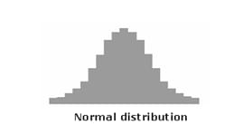
इस बात का ध्यान रखे की हर process में इसी तरह का Normal Distribution Graph बनना possible नहीं है वो skewed distribution भी हो सकता है।
2. Skewed Distribution
skewed ( तिरछा ) इस तरह के graph एक side shift होते है और asymmetrical होते है , इस distribution में peak center से एक तरफ बनता है।

एक example के द्वारा हम समझ सकते है जैसे की हम किसी product के data को analyse कर रहे है जिसकी शुद्धता अच्छी है इस वजह से सभी points 100 % pure होंगें और एक Graph बनायेगें , जो एक एक side बनेगा। 7qc tools kya hai
3. Double – Peaked or bimodal distribution
ये distribution graph देखने में दो camel की humped ( पीठ ) के तरह दीखता है , इस तरह का graph तब सामने आता है जब 2 process अलग – अलग distribution (Dimension) से बना हुआ होता है और इन दोनों process को जब combined कर दिया जाता है , तो ये graph create होता है।

Example :- इसमें हम किसी day का production data ले सकते है , एक ही din में हम 2 shift के data को लिया जा सकता है , इस तरह के operation bimodal हो सकते है। यदि ( 7qc tools kya hai) सभी shift में different – different distribution आ रहा है तो इसका मतलब ये है की problem आ सकती है।
4. Plateau
एक तरह के distribution graph को हम Multimodal Distribution भी कहते है , क्यूंकि इस तरह के processes में कुछ normal distribution भी mix सभी एक दूसरे के पास – पास होते है , इस तरह के ग्राफ में कई Peak points बनते है और इसको हम पठारिये ग्राफ भी कहते है।

5. Edge Peak
Edge peak distribution , normal distribution के तरह ही दिखता है , लेकिन इसमें एक बड़ा peak point बनता है और एक पुंछ ( Tail ) निकली हुई होती है , इस तरह के( 7qc tools kya hai) histogram graph तब बनते है जब graph के readings को सही तरह से नहीं fill किया गया हो , या फिर value ज्यादा fill हो गयी हो।

6. Comb Histogram
comb histogram tall और short दोनों बनते है ये कंघी के तरह दिखता है , इस तरह के graph तब बन जाते है जब Data एक दूसरे Round -off हो जाते है और या फिर सही से histogram graph न बनाने की वजह से।
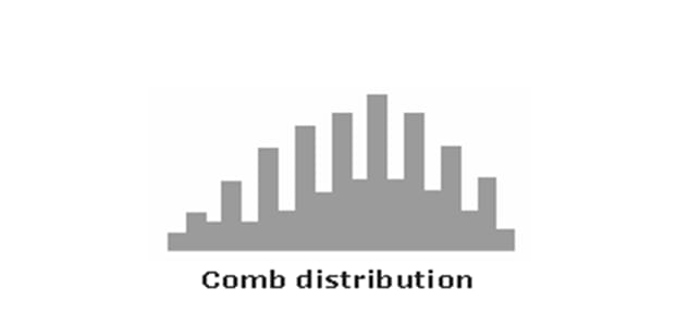
Example :- यदि है temperature data रहे है तो , हर सतह पर temperature कम या ज्यादा हो सकता है , इस कारण histogram ऊपर नीचे बनता है।
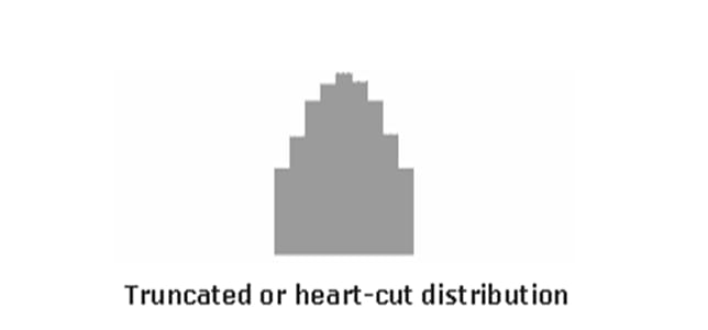
7. Truncated or heart – cut Histogram
Truncated histogram normal histogram की तरह ही दिखते है बस इसमें tails कटी हुई होती है ,इस तरह के histogram supplier द्वारा produce किये गए products को operate करने के दौरान सामने आते है , supplier द्वारा products को उसके specification limit और उसके out of specification में अलग कराया जाता है , ( 7qc tools kya hai) जब ऐसे products customer के पास एक साथ deliver हो जाते है तो ये histogram बन जाते है।
8. Dog Point Histogram
इस तरह का histogram कुछ specification missing होने की वजह से बनता है , और graph बीच से खली बनता है , ऐसा होने का कारण ये है या तो product lower specifications पर बने हुए है या फिर upper specifications पर इस कारण average मै कोई points नहीं आ रहे है।

3. Pareto Diagram/chart क्या है
Pareto chart/diagram का नाम Vilfredo pareto द्वारा दिया गया है , ये वो chart है जहां bar और line graph दोनों होते है और इसके द्वारा Data को represented किया जाता है। जहां पर bar descending orders को दिखाता है और line cumulative total को represent करता है। 7qc tools kya hai
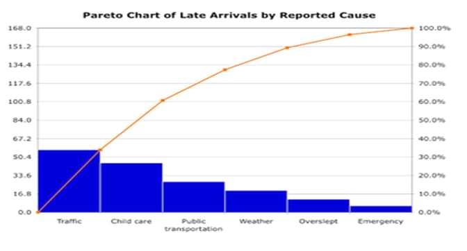
Pareto Chart मुख्य रूप से एक Graphical Representation होता है। ये bars को series में आयी problems की Frequency को दिखाता है , इस chart में सभी Data को हम categorized करके दिखाते है।
Pareto Chart Principle
Pareto chart को हम 80/20 Rule के नाम से भी जानते है , इसका मतलब ये की 80 % problems 20 % causes के कारण आते है।

- इस concept का प्रयोग छोटे और बड़े दोनों तरह के problems को solve करने के लिए किया जा सकता है।
- ये principle मुखता System और process के लिए apply होता है।
- इस principle के द्वारा हम किसी problem को identify कर सकते है , ( 7qc tools kya hai) में उसके causes को find कर सकते है।
Pareto 80 20 Rule Example
- 80% problems 20% कारण होने की वजह से आती है।
- 20% efforts लगाकर हम 80% results ला सकते है।
- 20% लोगो के द्वारा ही 80% problems create होती है।
- 20% road पुरे 80% Traffic को handle करता है।
- 80% meals किसी restaurant में 20% menu से आते है।
Pareto Chart कब प्रयोग करते है ?
- जब data को analyzing करना हो और problems की frequency को जानना हो और process में आने वाले causes को find करना हो।
- जब कई तरह के causes और problems एक साथ आ रहे है हो और हमें सबसे पहले most significant पर focus करना हो।
- जब हमें specific components के broad causes को find करना हो।
- जब हमें Data को Communicate करना हो।
- Problem को determine करने के लिए और उसको होने से रोक कर improvement के लिए।
Pareto चार्ट में data को कैसे collect करे ?
- सभी Data को Categories में collect करना है।
- Categories को पहले से ही लिख के रख लेना ज़रूरी है।
- sample size कम से कम 50 लेना है।
- सभी data कुछ समय के लिए है , यदि को process change होता है या किसी और तरह का change over होता है तो उसको Represent करना है।
Pareto Chart कैसे बनाये ?
- Categories को decide करे जिसे आपको groups में करना है।
- ये decide करे की कौन सा measurement किया जाना है जैसे – Frequency , Quantity या cost और time .
- Pareto chart के time period को decide करे की pareto chart कितने दिन का चहिये one work cycle या फिर full work cycle और day या फिर weak ( 7qc tools kya hai)
- Data को collect करे और category के according fill करे।
- सभी category के measurement का subtotal करे।
- सभी Data को collect करने के लिए Measurement system बनाये और सभी का maximum और minimum value निकाले।
- सभी maximum value का subtotal करे।
- सभी Category का Percentage % calculate करे , और category के subtotal को category के % से dived करे।
- इसके बाद Excel में Right Vertical axis बनाये और उसे Percentage के साथ दिखाए।
- सभी Cumulative data को जोड़ो , Ist और 2nd categories का subtotal करे , और dot लीख कर excel sheet में Bar के रूप में दिखाए , ऐसे ही 3rd category का subtotal करे और इसको भी chart में दिखाए ,सभी bars को मिलाये और compare करे।
4. Cause and effect diagram Ishikawa diagram

fishbone Diagram
Cause and effect diagram एक simple tool है जो defects होने के बाद उसके होने के कारण को दिखाता है , इसमें हम सभी मतों को graphical represent करते है. Cause and effect diagram को Fish Bone Diagram के नाम से भी जानते है , products के आने वाले defect के सभी symptoms को line का प्रयोग करके दिखाते है , ये 7qc tools kya hai में fish की bone के तरह दीखता है।
History of Cause and effect diagram
- Kaoru ishikawa द्वारा इस tool ( 7qc tools kya hai) को 1953 में introduce किया गया था जो University of Tokyo Japan में Professor थे।
- उन्होंने Plant के engineers के साथ मिलकर Quality problems को summarized किया और Cause and effect diagram को लाये।
- इस टूल द्वारा problems को आसानी से identify किया जा सकता है इस वजय से इसको JIS – Japanese industrial Standard terminology of quality control ने भी suggest किया है।
5. Scatter Diagram
scatter diagram एक tool है जिसका प्रयोग किसी दो variables में relationships को show करता है , और वो diagram है जिसमे cause और उसके effects के relationshipका पता चले scatter diagram कहलाता है।
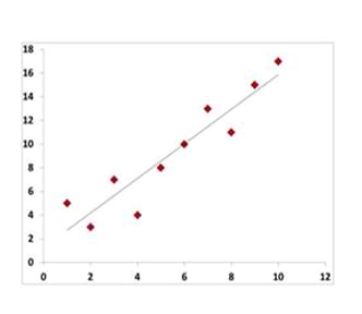
Example
- किसी products में specification Relationship
- inspection में होने वाले mistakes का तुलना।
- Machine speed और parts के length का relationship
Scatter Diagram कैसे बनाये ?
- 50 से 100 तक डाटा को collect करे और वही डाटा ले जिसका relationship करना है।
- Excel sheet में Horizontal और vertical axis ग्राफ को बनाये , higher figures को दिखाए vertical axis पर दिखाए यदि डाटा दो cause and effects तो higher value को horizontal axis पर दिखाए।
- सभी data का graph बनाये , यदि एक जैसा डाटा कई बार आ रहा है तो concentric circles बनाये।
- यदि Data अधिक है और ज्यादा same value आ है रही है , इसको हल करने के लिए हम histogram table बना सकते है , जिसमे vertically और horizontally data को दिखा सकते है। इस तरह के scatter diagram को correlation टेबल भी कहते है। 7qc tools kya hai
Types of scatter Diagram
- positive correlation
- Positive Correlation may be present
- No correlation
- Negative Correlation may be present
- strong Curvilinear association
- Negative Correlation present
coefficient of correlation (r)


coefficient of correlation का प्रयोग दो variables के बिच relation को ज्ञात करने के लिए किया जाता है।
जब coefficient of correlation (सहसंबंध गुणांक) सही perfect रहता है तो इसकी value 1 होता है और जब कोई correlation नहीं होता तो coefficient value 0 होती है। 7qc tools kya hai
Limited correlation की value 0 -1 होती है और ये negative और positive हो सकते है।
6. Control Chart
control chart एक graph के तरह है जिसमे हम graph के द्वारा समय के अनुसार process में होने वाले changes को समझते है , इसमें डाटा को time के according लेते है। Control chart में average का central line और upper लाइन होता है , upper line upper control limit को दिखाता है , और lower लाइन lower control limit को represent करती है , ये सभी डाटा Historical डाटा द्वारा आता है।
- control chart को shewhart charts और process behavior charts के नाम से भी जाना जाता है। 7qc tools kya hai
- control chart spc का एक tool है इसके द्वारा manufacturing process और business में statistical control को निकाला जाता है।
Types of control chart
डाटा के आधार पर Control chart को दो भागो में वर्गीकृत किया गया है :-

- Attribute Data
- Variables Data
Attribute Data
इस तरह के डाटा control चार्ट में एक single category में count करने पर कितनी बार occurrence आया है इसको represent करता है , इस तरह के count data द्वारा कई तरह के results सामने आते है जैसे :- pass/fai , yes/No , Presence/absence of a defect. 7qc tools kya hai
Variables Data
इस category के control chart में continuous variable measurement का result प्राप्त होता है , जिसमे हम time ,Temperature और radiation के example द्वारा समझ सकते है।
X bar R bar control charts
- X Bar – R Bar chart एक statistical process control chart है , जिसमे हम continuous data collect करते है , जिसमे सभी डाटा या तो subgroup होते है या time intervals में होते है।
- X Bar और R Bar चार्ट के प्रयोग कई तरह के जानकारी को प्राप्त करने के लिए किया जा सकता है
- जैसे – क्या process over time स्टेबल है , यदि process में कोई changes आती है तो इसका product पर क्या effect आएगा , और हमें यदि process unstable है तो कैसे पता चलेगा और उसका performance changes क्या होगी।
7. Stratification
stratification एक method है जिसमे हम सभी डाटा को उनके sub categories में divide कर देते है , और उसको group , division या उसके level के अनुसार set करते है , इस तरह करने से हमें समझने में आसानी होती है और problem को identify करना भी आसान हो जाता है। 7qc tools kya hai
Example :- हम इन सभी डाटा को stratified करके information प्राप्त कर सकते है।
- Equipment
- Shifts
- Departments
- Materials
- Suppliers
- Days of the weak
- Time of the day
- Products
- Survey Data
इन सभी डाटा को हम उनके categories में divide करके problems को जल्दी identify कर सकते है और root cause निकाल सकते है।
Flow chart
flow chart एक diagram है जो की workflow और process को represent करता है , ये steps को boxes में दिखाता है और next steps को box के साथ connect करके दिखाता है। इस तरह के model से आसानी से process के break down और work programs के defects को identify किया जा सकता है। 7qc tools kya hai
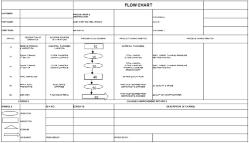
Types of Flow charts :-
- Document flow chart
system के द्वारा documents के control को दिखाना।
- Data flow chart
Data flow के control को दिखाना।
- Program flow chart
System में Program के control को दिखाना।
![]()